Design toolkit
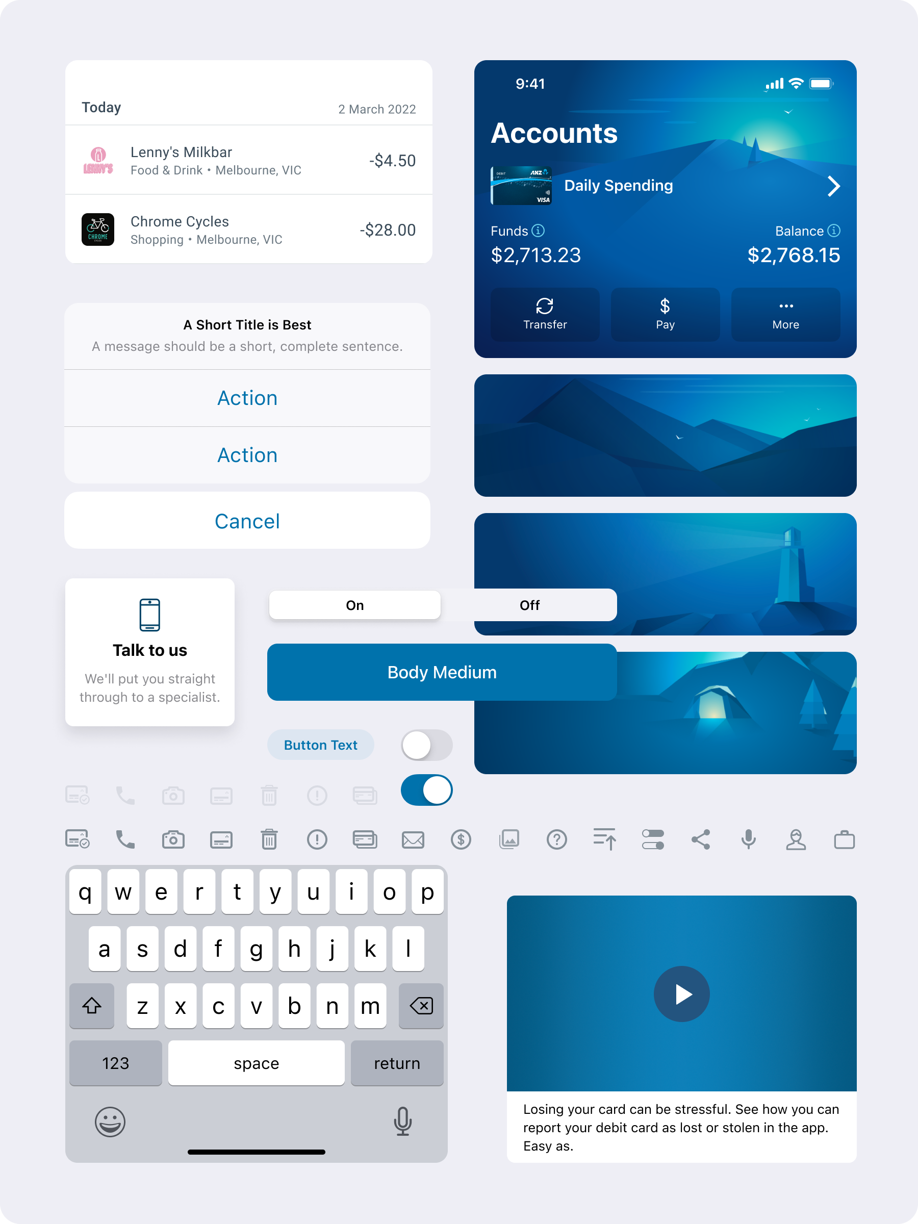
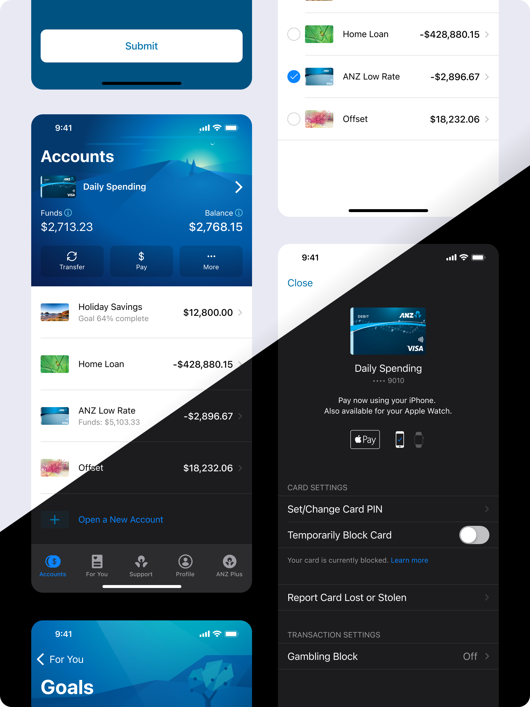
To design at scale and give designers autonomy, it’s crucial to create a focus on standards and shared application. How do we create consistency in line with the established brand language? The answer is an app-based design toolkit. It’s an evolution of simple tooling; allowing designers to create collaboratively with end users. Maximum flexibility, minimum complications, and no need to deviate from brand standards.
What were the project goals?
There are more than 11 teams developing new features in the ANZ App, so it’s critical that our designers have the tools to design at scale while their teams build. With a few designers working across many teams it’s also important that we build in a comprehensive review process to build consistency. This project aimed to reduce the overhead when creating design artefacts, allowing teams to be more autonomous and move quicker. Some key project objectives included:
a standard design language across Android, iOS and iPadOS
a shared design/development framework and naming convention
accessible-first design approach with low vision and voice over accessibility standards built into the library
a single source of truth for design language respecting platform conventions and interactions
a commitment to ongoing maintenance and evolution of both design standard and tools through the platform life


120+
Unique components
1.3k+
Component variables
80+
Features delivered with 100% integration
Flexibility for all use cases
A key focus of the toolkit both in the content organisation and its use, was to create a means for scale without impacting the learning curve. Components are customisable by end users, allowing for endless combinations of data inputs, but also come with a range of pre-built outputs all of which pre-approved values allowing for consistency and fewer legal reviews.
Delivery at pace
By creating a component library that is simple to use, quick to deliver and intuitive for designers we could shift focus from re-creating elements to creating more intelligent solutions. High-fidelity design is able to be produced quickly – enabling rapid feedback loops with an artefact that is closer to the end state.
Inclusive by design
The app design toolkit places great emphasis on designing with accessibility in mind. The design assets cater to a range of accessibility needs, including low vision due to environment or user need, voice-over support for users with visual impairments, and cognitive load reduction for easier use and comprehension. To ensure AA compliance, all design assets meet standard color contrast requirements, as well as supporting dynamic type. Moreover, the team has developed comprehensive voiceover accessibility guidelines that are integrated into the component library, making it easy for developers, analysts, and all team members involved in the app's development to ensure its accessible.
The outcome
With a focus on standardisation and delivery enablement, the toolkit has enabled delivery of over 80 features to our 4 million+ customers since its inception. With a focus on end-to-end delivery, the toolkit allows teams to reduce design and development tasks assisting in both speed to customer as well as rapid enhancement and ideation through design inception phases.
