IA and Feature Discovery
Since the launch of the ANZ App, the team have introduced a significant amount of functionality – including card activation and management, account statements, spend tracking, savings goals, expense tracking, further payment functionality and more.
The Problem
As more features are introduced to the app, customers are finding it difficult to locate and leverage these new features.
The current navigation structure was built to display features in context of where a customer may use, or associate that action. Through continuous research however, we have found that customers are struggling to locate features that don’t lend themselves to this type of pattern.
Unpack and explore
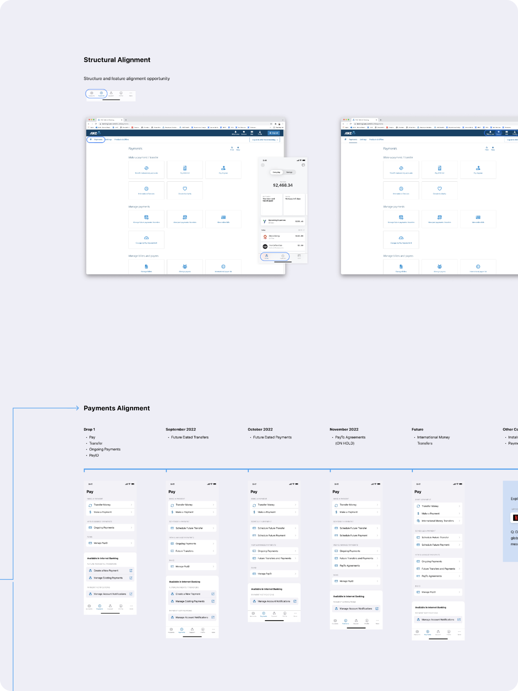
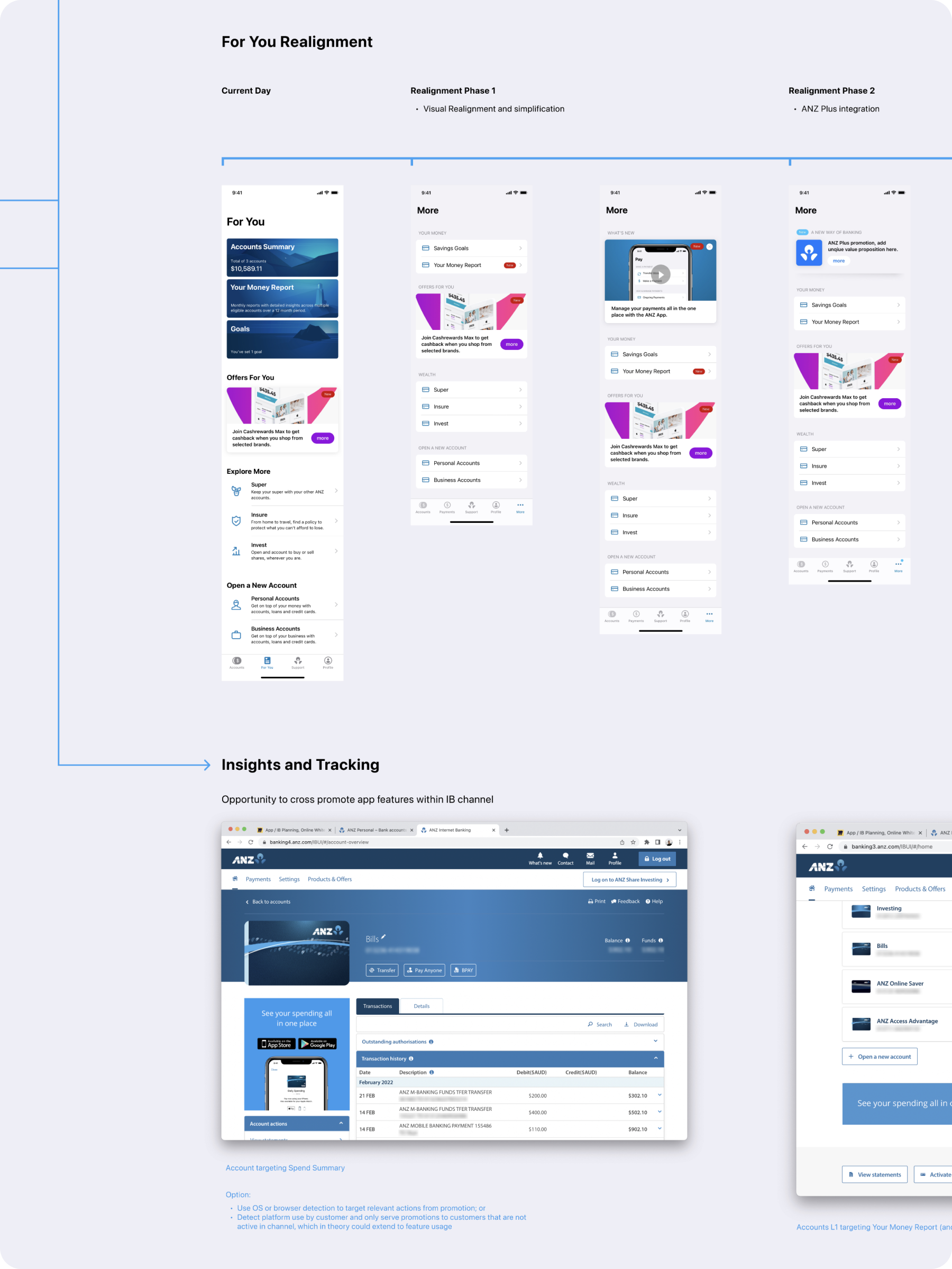
During the analysis phase, we dedicated time to unpacking the existing feature mapping and information architecture of not just the ANZ App, but also the Internet Banking platform and the current ANZ Plus app. Our goal was to identify opportunities for platform alignment. To achieve this, we used card sorting validation and low-fidelity structural testing. This was followed by a comprehensive quantitative testing project focused on testing the hypotheses formed during the initial phases.


An agile approach
Taking the findings from the initial discovery work, the next phase focused on how we could deliver these insights with an aim to minimise the impact on current inflight work while aligning to customer and business needs. UI and interaction solutions were developed around common patters in digital platforms and validated through customer testing.
Current
Identified as opportunity areas in customer testing, our focus was to rethink the three high-level entry points (Profile, More and Support), and move toward a more centralised menu structure.
Stage One
As part of a current piece of inflight work, the Profile entry point was to be relocated to the Tab Bar, bringing together two of the identified ‘preferred entry points’.
Stage Two
A further alignment of the navigation would bring together all three high-level entry points. This consolidation would enable a simple navigation structure and in turn, an uplift in organic adoption.
Consolidate. Simplify.
Creating a simple, single navigation pattern in the app will create a simpler experience for our customers and enable the space to flex as necessary.
This pattern will create a single place for all existing features with minimal rework. Current architecture can be leveraged with the only structural change being the movement of feature entry points into the global navigation – a pattern that is used widely in app design, as well as many digital and analogue applications. By leveraging familiar patterns, we address not only the discoverability, but also Information Architecture (IA) issues that have presented throughout the app’s lifecycle.
Technical delivery
In parallel with design discover a technical analysis was conducted looking at the current API landscape. This paired with customer and business value was able to shape a solution that required no additional backend solutions to be created minimising both cost and delivery timelines.
The finer details
With a focus on both the content and execution, our team prototyped high-fidelity concepts and took them to testing. These concepts included not only feature-specific tasks, but also the interaction patterns that would appear in production.


